Moses (1995)
TV Movie
Directed by Roger Young
Ben Kinglsey – Moses
TV Movie
Directed by Roger Young
Ben Kinglsey – Moses
email messages from Rochelle Altman
to Scott Meyer
August 7, 2003
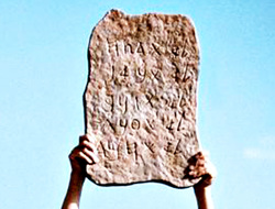
It's not very good.
The shape reminds me quite forcibly of the Armazi Greek/Aramaic
stele... The only thing they got right was filling the tablet... and even there they allowed zigs and zags. Yes, it does say quite a bit about the producer and the artist and their particular culture, doesn't it.
The script is a mixture of Phoenician graphs from different periods and areas with a Latin 'h' and Greek 'y' thrown in...
Nobody expects people to examine these tablets this carefully. I wonder if you know about the trick map-makers use to catch copyright infringements. I'll bet that the Latin & Greek graphs on this one and the 'uncial a' on the other are copyright protection using the same trick. If someone copies these wrong graphs, they had to have copied this tablet.
No, nobody can copyright the words of the Bible, but one can copyright a representation of the tablets as long as it's a new expression... and this one, with that absurd tablet sure is.
August 8, 2003
To me it looks like a combination of the Armazi and a poorly stretched animal skin.
The main part of the Kingsley tablet, like the Armazi, is "rough-hewn." The Armazi is a poorly dressed rectangle, with a bulge to slightly round the sides about two-thirds of the way up to end in a slight "cloud arch" with a flat top...
On the K. tablet, they have the same type of poor stone dressing, round wiggle at the side, and a flat top. What is really wierd is the way they have imitated the type of scalloping you get on improperly stretched skins in that scalloping on the bottom of their tablet. (Now stone stretches???)
There are good reasons why the Armazi is such "amateur" work. When a decree or dispensation or what have you type of official text was recorded in stone, it was the subject peoples who supplied and paid for the prepared writing surface -- stone, skin, papyri, etc. (People had to pay for the papyrus used for their tax receipts. Some things never change ...)
>That's an interesting theory
>about the map makers' tricks to catch copyright infringers. I've
>heard people seeding mailing lists with specific names for similar
>reasons. I'd be surprised to find that would explain what appears
>to be sloppiness.
I didn't say that the wrong graphs explains the sloppiness. The sloppiness is a sign of alterity, ancient = primitive, with a healthy dose of contempt mixed in.
I don't know how much of this problem you run into, but I see it all the time.
Examples:
Overheard: A Renaissance scholar teaching students "humanist" paleography. Student: why are the letters of different sizes. Teacher: Oh, that doesn't mean anything; they were finally learning to write evenly. (Never mind that people had been writing for more than 4,000 years prior to the Renaissance and just might have known what they were doing.) Another: a paleographer wrote that "the script was brought to perfection..." Tell me, Scott, how the heck do we know what folks back in the 7th century thought of as "perfection"???
Yet another, with regard to a 14th CE librarian/precenter: His writing is uneven; some of his letters are larger than others and he uses two different forms of 'A' and... and so on. (Let's not get into the alterity driven $#@% fake second inscription on that bone-box! See what contempt can do to you fellahs??)
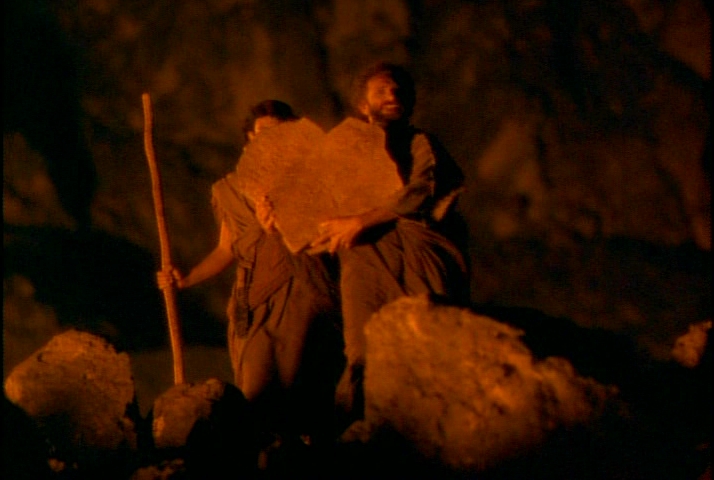
Alterity in action: applying modern aesthetics to ancient objects... I'll say this for the 1956 production; not a sign of the alterity driven contempt for the ancients that we see on the 1923, POE, and this Kingsley "reproduction." Moser's tablets are barely rounded at the top...
to Scott Meyer
August 7, 2003
It's not very good.
The shape reminds me quite forcibly of the Armazi Greek/Aramaic
stele... The only thing they got right was filling the tablet... and even there they allowed zigs and zags. Yes, it does say quite a bit about the producer and the artist and their particular culture, doesn't it.
The script is a mixture of Phoenician graphs from different periods and areas with a Latin 'h' and Greek 'y' thrown in...
Nobody expects people to examine these tablets this carefully. I wonder if you know about the trick map-makers use to catch copyright infringements. I'll bet that the Latin & Greek graphs on this one and the 'uncial a' on the other are copyright protection using the same trick. If someone copies these wrong graphs, they had to have copied this tablet.
No, nobody can copyright the words of the Bible, but one can copyright a representation of the tablets as long as it's a new expression... and this one, with that absurd tablet sure is.
August 8, 2003
To me it looks like a combination of the Armazi and a poorly stretched animal skin.
The main part of the Kingsley tablet, like the Armazi, is "rough-hewn." The Armazi is a poorly dressed rectangle, with a bulge to slightly round the sides about two-thirds of the way up to end in a slight "cloud arch" with a flat top...
On the K. tablet, they have the same type of poor stone dressing, round wiggle at the side, and a flat top. What is really wierd is the way they have imitated the type of scalloping you get on improperly stretched skins in that scalloping on the bottom of their tablet. (Now stone stretches???)
There are good reasons why the Armazi is such "amateur" work. When a decree or dispensation or what have you type of official text was recorded in stone, it was the subject peoples who supplied and paid for the prepared writing surface -- stone, skin, papyri, etc. (People had to pay for the papyrus used for their tax receipts. Some things never change ...)
>That's an interesting theory
>about the map makers' tricks to catch copyright infringers. I've
>heard people seeding mailing lists with specific names for similar
>reasons. I'd be surprised to find that would explain what appears
>to be sloppiness.
I didn't say that the wrong graphs explains the sloppiness. The sloppiness is a sign of alterity, ancient = primitive, with a healthy dose of contempt mixed in.
I don't know how much of this problem you run into, but I see it all the time.
Examples:
Overheard: A Renaissance scholar teaching students "humanist" paleography. Student: why are the letters of different sizes. Teacher: Oh, that doesn't mean anything; they were finally learning to write evenly. (Never mind that people had been writing for more than 4,000 years prior to the Renaissance and just might have known what they were doing.) Another: a paleographer wrote that "the script was brought to perfection..." Tell me, Scott, how the heck do we know what folks back in the 7th century thought of as "perfection"???
Yet another, with regard to a 14th CE librarian/precenter: His writing is uneven; some of his letters are larger than others and he uses two different forms of 'A' and... and so on. (Let's not get into the alterity driven $#@% fake second inscription on that bone-box! See what contempt can do to you fellahs??)
Alterity in action: applying modern aesthetics to ancient objects... I'll say this for the 1956 production; not a sign of the alterity driven contempt for the ancients that we see on the 1923, POE, and this Kingsley "reproduction." Moser's tablets are barely rounded at the top...
